For some reason, whenever a release of newly restored Warner cartoons arrives, the restorations don’t excite me like those of the Golden Collections did in the, well, golden era of home video, 2003-08. Maybe it’s just me, but more often than not, the new restorations seem darker and less colorful than they used to. This began in 2010, when the Super Star titles were released, and a few cartoons looked like considerably less money was spent remastering them. The Looney Tunes Platinum Collection Volume Two, released today on Blu-Ray and standard DVD, continues this pattern.
In the case of the pre-1948 (formerly Turner, formerly United Artists, formerly A.A.P. package) titles, there’s no way they can get anything but better. What we had seen for years varied wildly, depending on the condition of the 35mm positive prints struck in the 1950s for television. When they uncover something truly historic, as in the original ending of the first Bugs Bunny cartoon Hare-Um Scare-Um that was cut for general exhibition almost three quarters of a century ago, it’s worth $20 to $30 just for that alone.
When a newly restored post-1948 short turns up, oftentimes they look much darker than I’m used to. The contrast looks completely off, and the subtleties of the background styling (particularly the lighting) are far too muddy.
The cartoons of the first Golden Collection volume were not remastered in high-definition, therefore new masters had to be made for this release. Elmer’s Candid Camera, Wabbit Twouble, Bugs Bunny Gets the Boid, Long-Haired Hare, and Rabbit, Fire all look practically identical to the earlier 2003 release. On three others, however, it looks as though they used inferior material.
The acid test – compare the older versions to the new re-masters.
Rabbit Seasoning
Canned Feud
The Foghorn Leghorn
This seems to be the same dilemma as last year’s Tom & Jerry release, on a much smaller scale. No, I don’t think either version is perfect. The 2003 versions’ colors tend to be far too neutral, even bleached, but the picture is far clearer and sharper. This was WB’s first major animation release, after all, and the title selection was made from a pre-determined list.
Now in 2012, the kind of detail we appreciated in the Golden Collection years is muddled. In the case of Canned Feud, one of the finest comedies ever made, its original titles were reinstated (you can see on the WB Classic Animation Facebook page a video of their ‘process’, where you can clearly see the splice where they made the cut in the titles for the reissue), but now the beautiful work of Hawley Pratt and Paul Julian has been compromised.
What is most interesting is that one of those premiere volume titles from 2003, Deduce You Say, looks considerably better in its latest edition. The color is unquestionably richer.
I’m sure one of the Internet ‘experts’, the same ones who chided me last year for daring to suggest I knew more than them about the Tom & Jerry situation, will declare boldly that the newer HD version is superior and place blind faith in Warner Home Video. Regarding the T&J release, superior elements on those offending titles were available, and they just simply weren’t used.
With the WB cartoons, it obviously isn’t self-sabotage/willful ignorance. What is apparent is that WHV has new policies in place in the restoration department, ones with varying dependability and far less funds at their disposal. Thanks to the dictatorship of former President Dick Cheney and his puppet George W. Bush, there’s a lot less money for non-essentials these days. Perfect Looney Tunes restoration is probably the least of the average person’s worries. There’s nothing warranting a true cry of foul yet (like the abhorrent ‘widescreen’ versions they’ve thankfully killed off). At least they’re not using faded Eastmans or truly horrid material. And when it comes down to it, I think we can all agree that most of the best and important Warner films have gotten the royal treatment on home video already. I mean, does anyone really care if A Horse Fly Fleas looks perfect? (Actually, the original titles reinstated for that cartoon have serious image bleeding, looking as though they sourced a 16mm Cinecolor print. Warms my heart.)
I’ve just returned from my first visit to the Ottawa International Animation Festival. I left it feeling inspired, though it’s a very complicated sort of inspiration.
The worst things I have to say about the festival seem to echo the thoughts of everyone else I spoke with. First and foremost, it’s too expensive and I didn’t feel I got my money’s worth because the scheduling is so horrendous. (I tried to make up for it by drinking as much free alcohol as I could at the Cartoon Network Picnic and Mercury Filmworks party – a hassle in itself with so many animators present.) I missed out on several screenings I wanted to see because they were either playing against something else or were simply too far away to make it in time. It’s impossible to please everyone, certainly, but a little more effort could be made.
The introductory video that played at every screening is unworldly awful. It’s almost schizophrenic going to a generally artsy festival and getting blasted with an obnoxiously loud advertisement for homogenized commercial animation wherever you go.
I only went to one competition screening, Short Competition 5, bearing in mind the popular opinion of the films screened in Ottawa: dreary and depressing. A great number of them absolutely fit that bill. Several seemed to hardly have any animation at all, and OIAF actually subjected its audience to an abhorrent CGI Coca-Cola commercial as part of the competition (easily the worst 45 seconds of my weekend). Yet I must have lucked out because several of them were entertaining and even funny. Rob Shaw’s Portlandia ‘Zero Rats’ was a bit too “College Humor” for my tastes to be truly hilarious, while Grant Orchard’s A Morning Stroll made excellent use of mixed medium to illustrate changing societal views as they relate to a New Yorker cartoon. The clear winner was Don Hertzfeldt’s It’s Such a Beautiful Day, which seemed to make fun of every single bad film that preceded it, and quite possibly all of the ones I didn’t see. I was in tears laughing at it and sincerely hope it wins the Oscar.
The key to enjoying the festival thoroughly, as Greg Duffell once told me, is to skip the competition screenings and only go to the retrospectives. It is also more of a social gathering than anything else, as all conventions and festivals really are. I got to see friends like Bob Jaques, Steve Stanchfield, Mark Mayerson, Mike Kerr, and Mitch Kennedy again, and as someone who doesn’t live in an animation ‘hub’ like L.A. or N.Y.C., it’s always invigorating to talk cartoons aloud with people who actually know what I’m talking about.
On Mark’s recommendation, I went to the retrospective of Barry Purves, a British stop-motion master. If you’re unfamiliar with Purves’s work, you’re in for a treat. I’m more partial to his work for children’s television, like The Wind in the Willows, than his operas like Rigoletto and Gilbert and Sullivan, where the music almost overwhelms the brilliance of his craft. His other strictly narrative shorts, like Screenplay embedded below (warning: it’s quite explicitly graphic), are far more successful in Purves’s aim to take animation into uncharted territory. There is something curious about stop-motion. It’s been steadily more daring than traditional or CGI animation have been over the years, yet it receives almost zero critical attention. Perhaps it’s because it’s seen strictly as an unserious novelty, thanks to its most visible feature films regularly steering into farcical gothic territory. As Purves’s body of work shows, stop-motion is no different than the various stigmas against other forms of animation: it’s capable of far more than people like to believe.
I met Amid Amidi for the first time, and he was just brimming with excitement over his highly anticipated Ward Kimball biography. If you didn’t see his excellent presentation on Kimball’s life and work, you missed out on some priceless home movie footage of Kimball and Walt Disney back in the day, the live-action reference for the crows in Dumbo, and even some homoerotic gag drawings by Kimball that Amid wasn’t allowed to put in the book.
I had asked Amid earlier at the Cartoon Network Picnic why Kimball stayed at Disney’s for his whole career when he was easily the most singular visionary in the studio’s entire history, and he was asked again during his presentation. The short answer: because the footage rate at Disney’s was so low and there was so much paid downtime between projects, it wouldn’t have made sense for Kimball to work somewhere else. Had he worked at a studio with a normal footage rate like Warners, he would never have had time to devote to his music, trains, and fine art painting, and thus, we would never have had the eclectic and eccentric individual that was Ward Kimball at all. His life is a reminder of the importance of broadening your horizons and skill set, so you’re not wearing one hat all of your life.
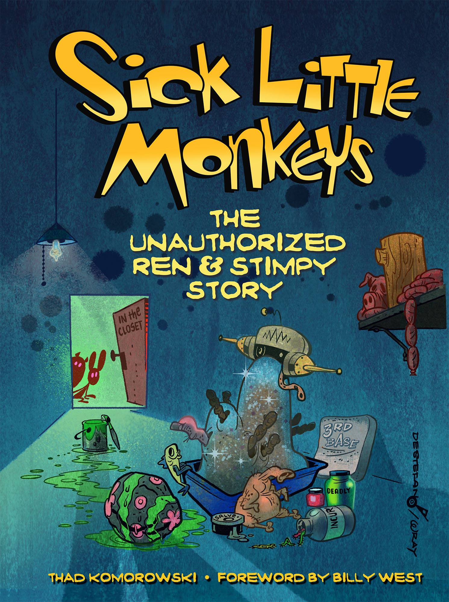
Needless to say, I’m absolutely dying to read Amid’s book. If you buy one animation book next year that isn’t my Sick Little Monkeys: The Unauthorized Ren & Stimpy Story, it should be Full Steam Ahead. But you should probably buy both.
To clear up some misinformation I helped spread unintentionally years ago, Mickey Mouse’s fantastic dance in Mickey’s Birthday Party is animated by Ward Kimball. Why does the animator’s draft credit Ken Muse and Riley Thomson then, with that curious “music room” credit indicative of reused footage? Because, as Amid uncovered in his research, Kimball had animated that dance for The Reluctant Dragon and it was scrapped. For the 1942 cartoon, Muse and Thomson only changed Mickey’s outfit.
Amid’s presentation would have been my favorite part of the festival if Ralph Bakshi hadn’t been there. It was very disturbing, though also revealing, that the auditorium where Bakshi’s one-on-one talk with Morgan Miller took place was not filled to capacity. Not just a true animation legend, literally animation history was on stage, and hundreds of people could care less. But it is typical of this medium, one which regularly holds the mutilation of its history in highest esteem.
Bakshi is a polarizing figure. There’s certainly a case to be made for his self-destructive nature, while it’s still hard to build a passionate case against him when almost all of his movies were made for under a million dollars, with practically no storyboarding and zero pencil tests. Those are not the kinds of opportunities many animators in any era would be jumping at, most certainly not Richard Williams and Don Bluth (two guys hung up on a craft with ultimately nothing to say).
I saw two Bakshi films in the retrospective. The 35mm print of Fritz the Cat was absolutely gorgeous, and in spite of some of its inherent messiness and stupidity, I was struck by how accurately the film captures the white liberal art student’s mindset (which is messy and stupid) and just how beautiful and fun so much of the animation was. (You haven’t lived until you’ve seen Jim Tyer’s footage in that thing on a big screen.) Steve asked Bakshi what it was like working with Tyer, and the man’s eyes absolutely lit up at the question: “He was the greatest animator who ever lived.” I later asked Bakshi what John Gentilella animated, outside of Blue the biker-Nazi-heroin addict rabbit. He said and wrote his response as he was signing my copy of Ralph Bakshi: Unfiltered: “The car.”
Coonskin is another story, and not just because the print screened was a faded Eastman. The high level of pure incoherence that wrecked many of Bakshi’s later films isn’t there yet, but it could have easily been a much better film had it just been tweaked only slightly. For one thing, there isn’t a single compelling or relatable character in it, like Duke in Fritz or Ida in Heavy Traffic, which a film like Coonskin, just brimming with the makings of brilliant character animation, requires. (I actually first saw Bakshi when he arrived unannounced to introduce Coonskin. He left immediately after that, saying, “Nah, I don’t wanna fuckin’ see it.”)
Bakshi said he’s aware of his films’ rough edges and in some cases their badness. He seemed to almost relish critics taking him to task for it. The charge of “undisciplined” against Bakshi I’ve ready many times seems to be a bit unfounded when you apply it to any filmmaker. To fault Ralph Bakshi for a lack of discipline seems to miss the point of Ralph Bakhi – his films were always like him (unshaven and grungy) going back to the Terrytoons and Paramount shorts he directed in the 1960s. Critically and professionally irresponsible is another matter, and certainly applicable to a great many revered late twentieth century animators, Bakshi probably included. The criticism should not be entirely over the crass surfaces and execution of Bakshi’s films, but if there’s nothing beneath them. In many cases there almost certainly is, and, unfortunately, in many cases there absolutely isn’t.
Whether or not you like Bakshi’s films or the man himself, though, is irrelevant. He had an original point-of-view and he achieved what he set out to do: to make American animation outside the Disney ghetto acceptable to the public. In spite of its flaws, I still think Heavy Traffic may be the greatest animated feature ever made.
While writing Sick Little Monkeys, I came to the conclusion that a lot of what’s perceivable as Bakshi’s flaws is largely inherent to what animation is in general: “a subsection of humanity’s most uniquely talented and dysfunctional.” By default, it’s unrepairable. As Bakshi told the audience though, it’s just amazing at what one can do single-handedly in this age of technology, and there is no excuse to be tied to any one system with so many options available.
The Ottawa Festival itself is also largely reflective of this. The conglomerate waste, pretension, and frauds are never going to go away. Yet there is much inspiration to be found in its crevices. The way for anyone with an interest or career in animation to retain the little sanity they have left is to ignore everything else and just pursue that little inspiration as positive reinforcement. The medium is beyond mending, so let’s have fun if we can. I will certainly try returning to Ottawa just for that alone.
Via Jaime Weinman, I see that Hogan’s Alley has posted historian Jim Korkis’s 1982 interview with animation writer Bill Scott. Even if you’re not interested in his work for Jay Ward, there are still plenty of great anecdotes about him working as a writer at Warners, getting fired by Bob Clampett after asking for a raise, and how his status as a “Warner guy” at UPA was the “kiss of death”.
Below is the first cartoon he wrote for Art Davis (with Lloyd Turner), presented in all of its 16mm Cinecolor glory. Davis’s cartoons tend to be a little vacuous compared to the other directors, save when it’s a stronger story like Doggone Cats. In more Warner-centric interviews, Scott said Davis was more concerned with the layouts and animation than the story work, hence their visual sheen. Some animation fans rank Davis higher than Bob McKimson, another brilliant animator who became a director without a feel for story, but beneath the glitter of Emery Hawkins and Bill Melendez, a lot of Davis’s entries in the Warner canon are little more than trussed-up Screen Gems scripts (see Bone Sweet Bone, The Rattled Rooster, most of his Porky Pig cartoons). Unsurprising, of course, given Davis was a director of a sizable number of Columbia cartoons.
I’ve had an animator breakdown video for what’s arguably Davis’s best film, What Makes Daffy Duck, on my harddrive for almost two years now. I’ll dust it off and work on posting it sometime in the next week.
I’ve been periodically adding information to the WB Production Number Project as more original release prints and artwork have come my way. This tidbit, though, comes from film archivist and historian Bob Furmanek, regarding the release date of Lumber Jack-Rabbit, the only cartoon Warners released in 3-D.
It was released in 3-D on September 25, 1953 and re-released flat on November 13, 1954. It premiered on September 25, 1953 at the Hollywood and downtown Paramount theaters with the WB 3-D feature, The Moonlighter. Thanks to some bogus data in an error-riddled 3-D book, that wrong 1954 release date is all over the Internet!
I’ve amended the entry for Jack-Rabbit on my site. It would be helpful if those who like to mess around with Wikipedia and the IMDB would do some good and add this information there as well.
§
I’ve launched the Facebook page for my upcoming book, Sick Little Monkeys: The Unauthorized Ren & Stimpy Story, where I’ll be posting Ren & Stimpy related minutiae on a semi-daily basis. Spread the word, and keep an eye out, there and here, for updates regarding publication. If there is interest, maybe I will start occasionally posting some of the various interviews I did for the book here.