Lost and Found: A New Taste Sensation

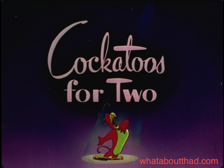
The Bob Wickersham-directed 1947 Color Rhapsody Cockatoos for Two was one of the last cartoons produced by the Screen Gems studio. Bob Clampett claimed to have written this one (along with Swiss Tease and Boston Beanie) while he was the studio’s “story editor/creative consultant”.

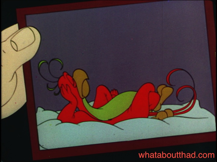
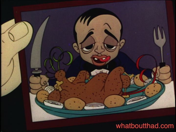
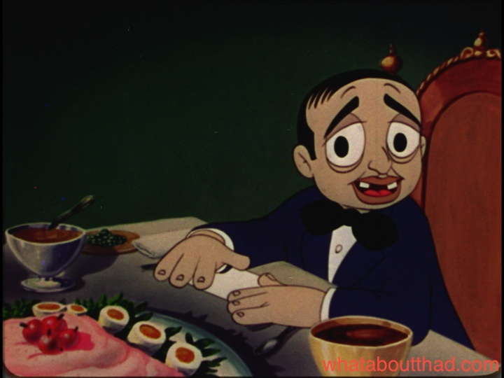
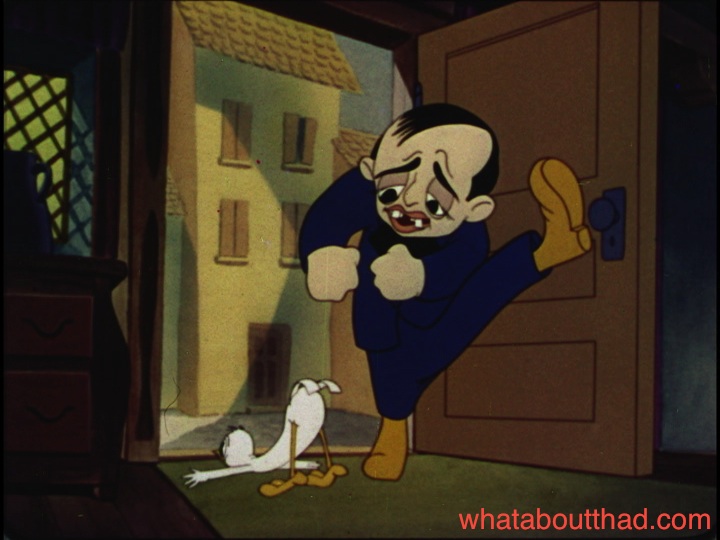
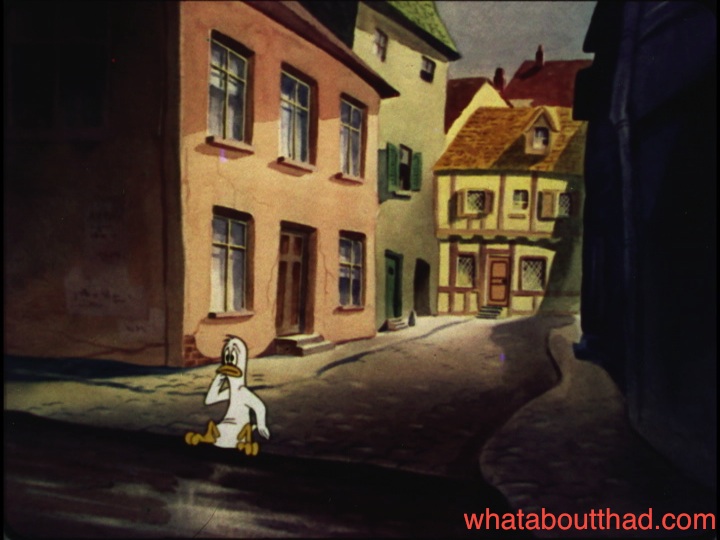
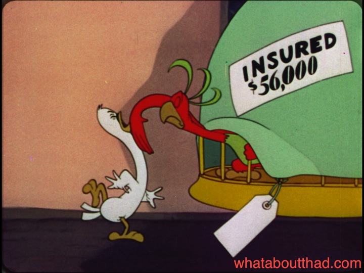
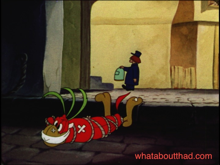
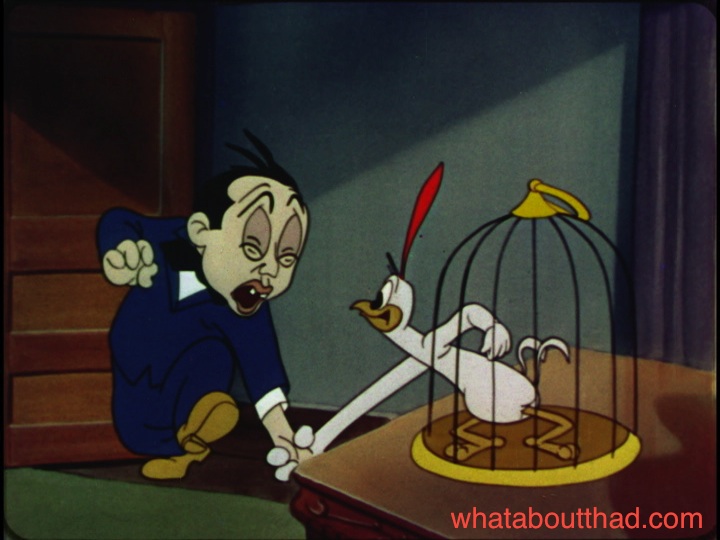
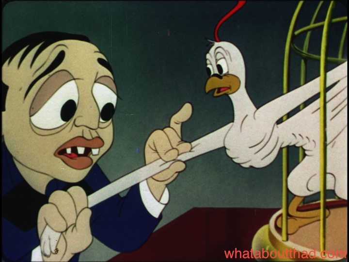
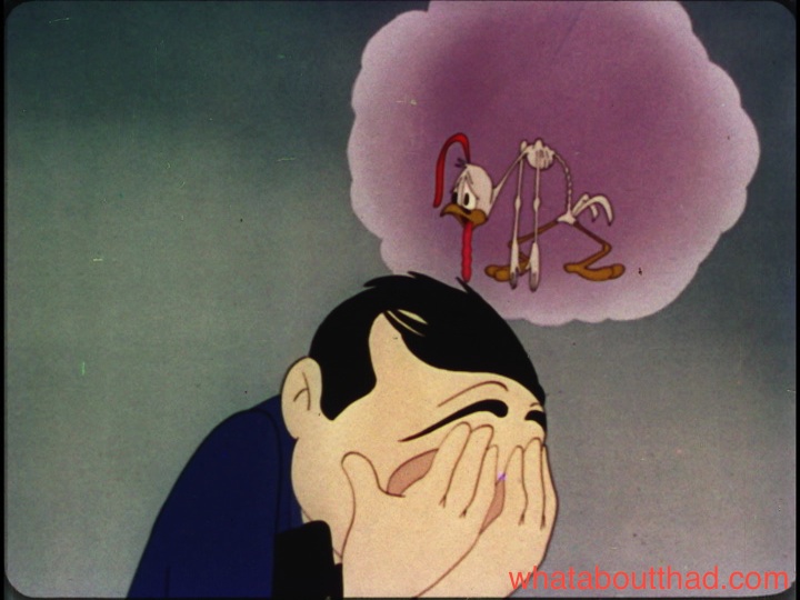
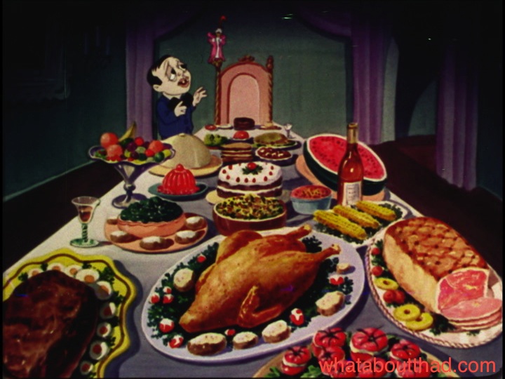
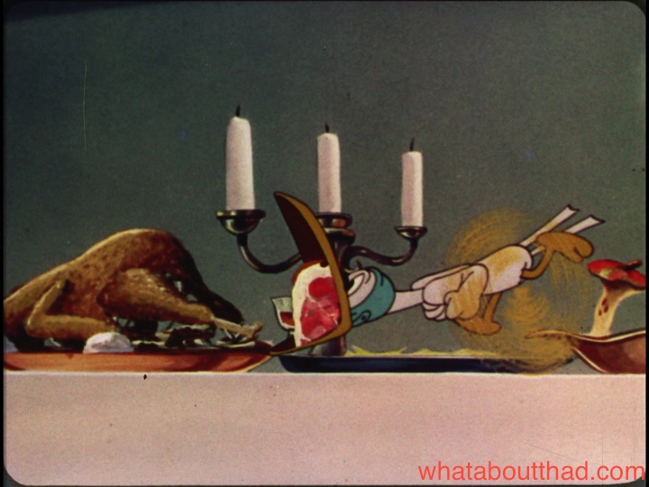
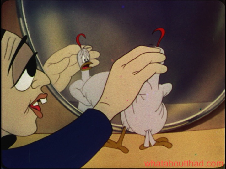
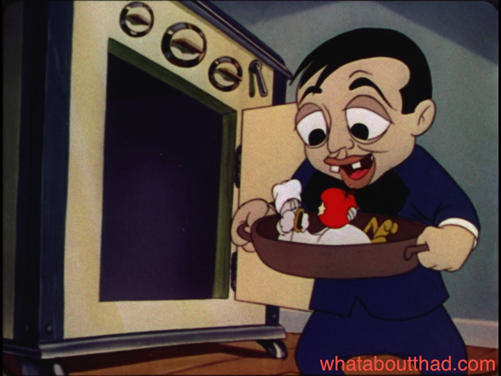
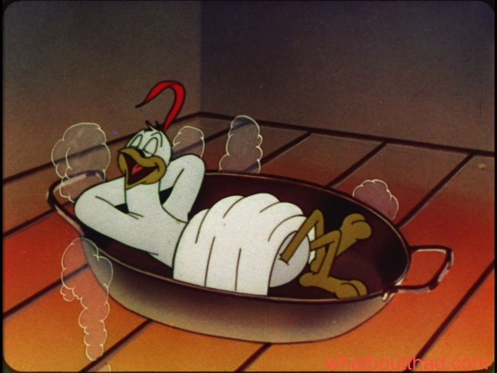
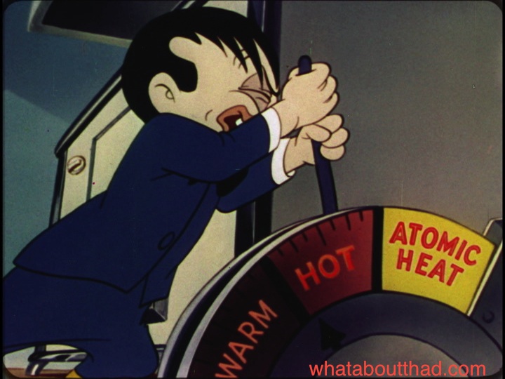
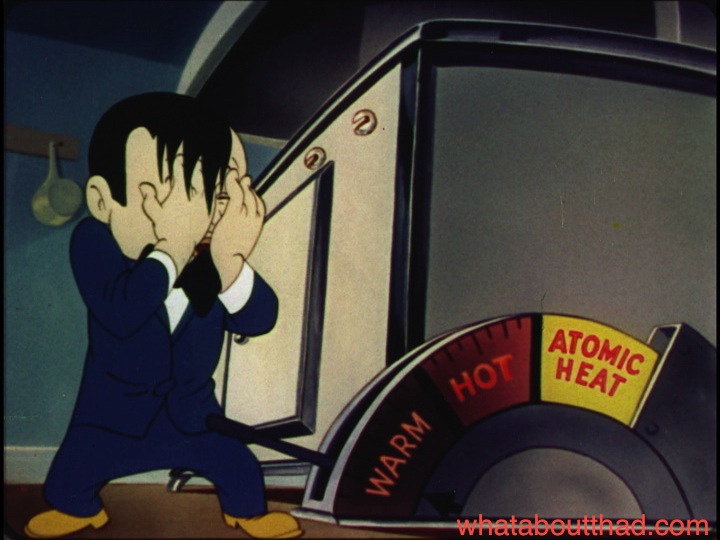
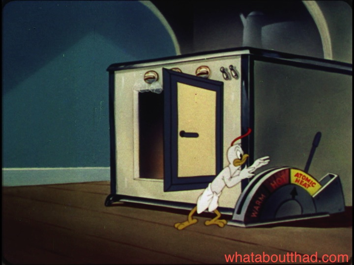
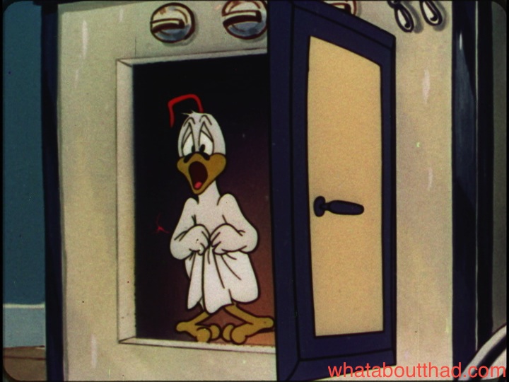
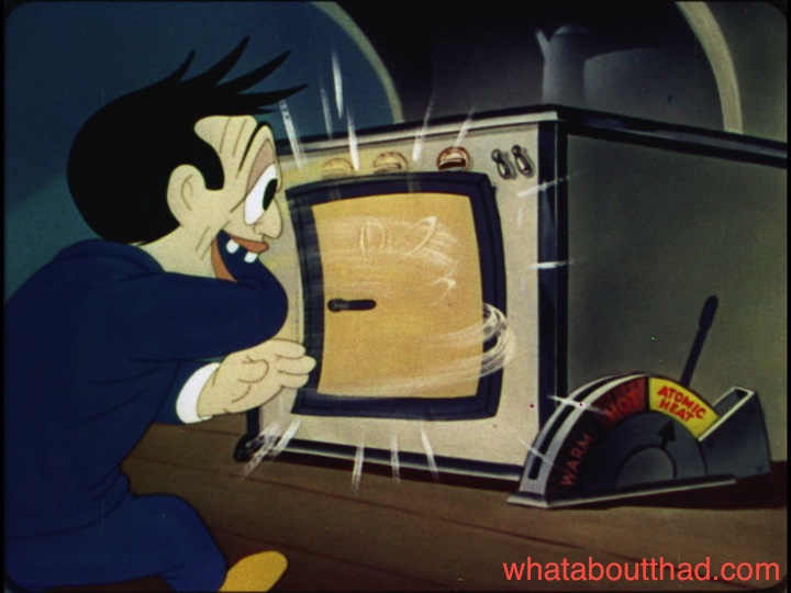
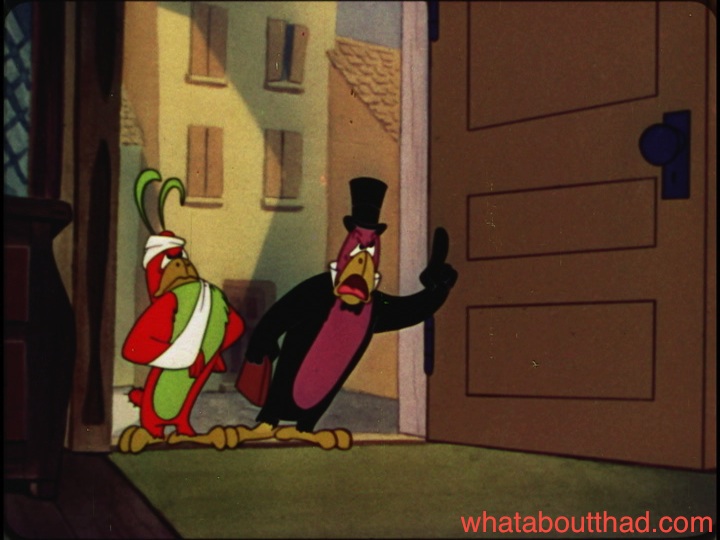
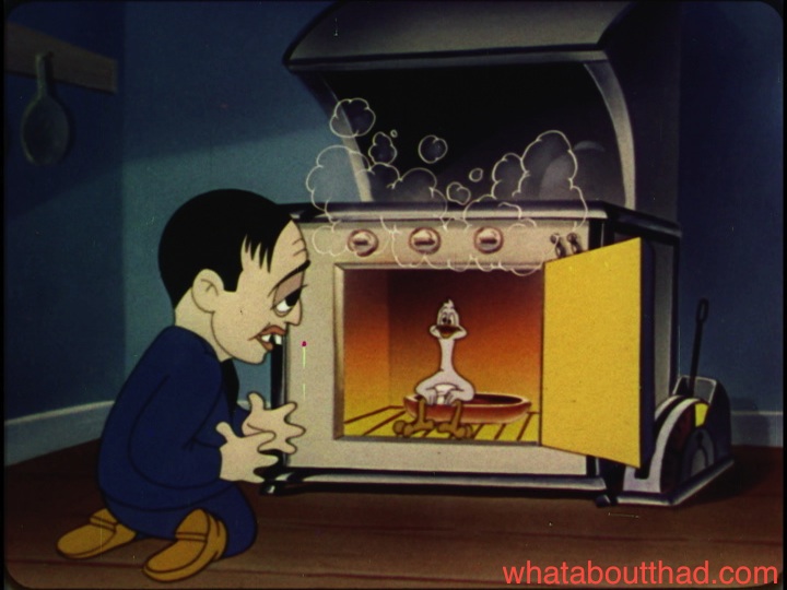
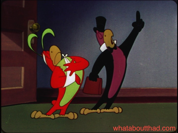
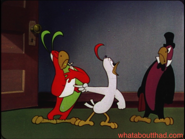
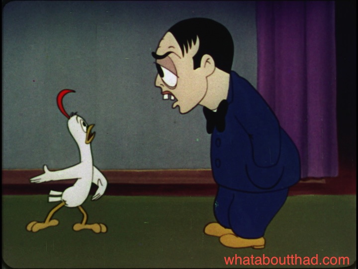
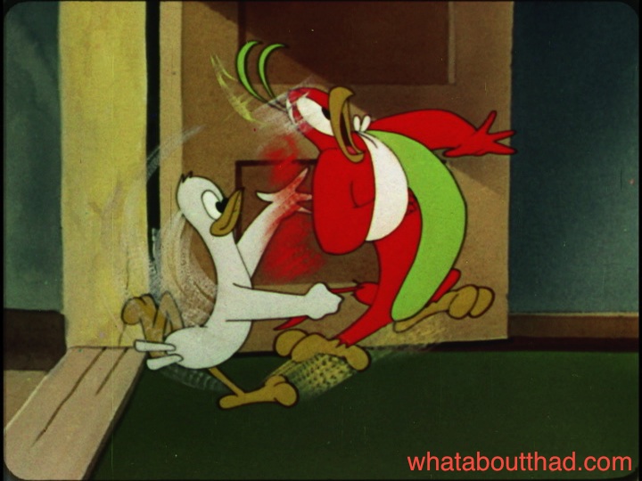
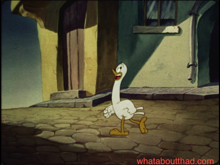
Clampett’s involvement is pretty self-evident. Mr. Sidney of 531 Greenstreet (a Peter Lorre caricature voiced by Stan Freberg) is tired of rich food and craves a “new taste sensation”. He receives word that his friend Hermosa Redondo is sending him a rare $57,000 pet cockatoo (only insured for $56,000). While Sidney eagerly awaits the new arrival, a homeless homing pigeon (voiced by storyman Cal Howard) sees this as an opportunity to get himself room and board by posing as an imposter. Naturally, the bird is ignorant of the devious intentions behind a six-course meal and Turkish bath.

The creepy Columbia WTF vibe™ is not absent, but there’s a sense of coherency in Cockatoos, and the others Clampett claimed to have written, that is lacking in all of the studio’s other cartoons of the period. This film at least tries to have a story and gags that make logical sense. Cartoons like Mother Hubba-Hubba Hubbard or Wacky Quacky (with its jaw-dropping rip-off of Daffy Duck) are as close to pure stream of consciousness as you can get for a 1940s cartoon.

Cockatoos is one of several Columbia/Screen Gems cartoons Sony claims to have either incomplete or zero elements on. The only version available for years was a B/W 16mm print, a transfer of which is embedded below.

I am convinced that this and most of the others Sony claims to be missing are still in their vaults unlabeled and unidentified. Columbia had the worst track record for preserving their material. Several cartoons, live-action shorts, serials, and movies from the immediate post-war era are still at large. (It’s even rumored that particular elements of the wonderful fairy-tale film noir Gilda, one of their most popular titles, were missing for years.)

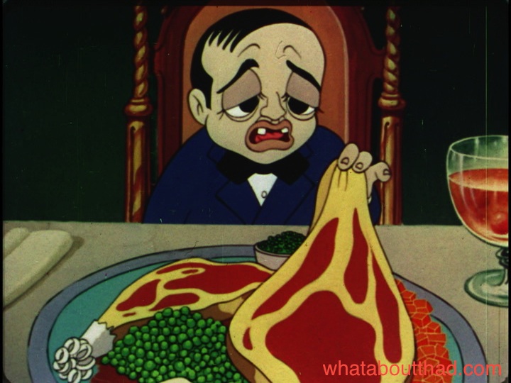
Fortunately, such is no longer the case for Cockatoos for Two. I was able to recently acquire a very rare original 35mm IB Technicolor nitrate print, which is on its way to a storage facility for safe keeping. I couldn’t send it off without making a fresh transfer for myself, so here are some tantalizing screen grabs from this extremely rare cartoon. I also hope that this helps end the ‘debates’ over what raw transfers of 1940s Technicolor cartoons are ‘supposed’ to look like. But that’s hoping for too much.


Saludasth-and-meatballsth ’till next time, pals…

Special thanks to Steve Stanchfield, Jerry Beck, and Fredrik Sandström for their help.

28 Comments

Filed under classic animation, wtf

Hey, who wants to see Farmer Alfalfa’s ass?

At 5:30.

This perplexing oddity seems to be a bizarre remake of a remake. I haven’t gotten through all of the mid-1930s Terrytoons, but The Cat Came Back (1944) looks like it’s tracing a lot of animation from a Connie Rasinski picture of that period – and in turn, borrowing material from a silent Fable. Tom Stathes begs to differ, but I’m curious what you think.

5 Comments

Filed under classic animation, wtf

Musings Down Candy Cane Lane

Amidst graduating and job searching, I’ve once again neglected this blog. Not much exciting to report at all, but during my travels, I’ve drawn a few conclusions about the restorations we’ve seen of classic cartoons in the digital-video-disc era.

The one complaint I always, always see, from fans and experts alike, is how “wrong” the colors look. They’ve been pumped up, they’re too bright, the lines have been “thinned” (which I guess is a confusing way to make one of the side-effects of DVNR its own separate problem). What’s hilarious is that I almost never see someone who actually knows what they’re talking about doing the complaining.

What I take issue with in general is that most of these guys have likely never handled film elements in any capacity, so the basis of their complaints is hollow. They’re merely saying what they think the cartoon should look like with no solid foundation for their argument.

After handling some several hundred IB Technicolor elements going back to the 1940s (including 35mm nitrate material) it seems to me that the vast majority of the restorations of classic cartoons done in the digital era are, indeed, an accurate representation of how the films originally looked. I’ll concede that occasionally you’ll find a print with over-contrasted colors due to a film lab goof, but the faultiness of a physical print is immediately self-evident in a way a video transfer isn’t.

There are, of course, exceptions. We all know about the recent problems with the Tom & Jerry Golden Collection using faded CRI elements when better ones were available. Both volumes of Woody Woodpecker and Friends are loaded with transfers from elements of the same mold, where the Eastman deterioration is appallingly evident. The history of the Disney animated feature library on home video is tainted with devious revisionism.* (* Not all revisionism is bad. Sometimes revisionism makes things how they should have been in the first place!)

But those are issues mostly stemming from source material. When it’s done right, like it is on most of the Walt Disney Treasures and all of the Looney Tunes Golden Collection releases, it’s virtually a perfect representation of seeing the cartoon back in its original release. The naysayers have no idea what they are talking about.

Or at least I thought they didn’t.

My impressions before now have been entirely based on viewing the DVDs on my computer or standard definition TV sets. (At this point in my life, I don’t own a TV set of any kind and foresee no reason why I should buy one.) Over the holidays, I visited with a few chums who are blessed enough to own those fancy high-definition flatscreens and watched many cartoons, including a few of the commercial Warner releases, there.

Now I finally understand where the detractors are coming from. Some of the color restorations by Warners do indeed look awful when played on flatscreen TVs. I haven’t sampled the new Blu-Ray Looney Tunes release, but for some reason the flatscreen sets distort those DVD releases to no end, pumping up the color to levels I had never seen before. Literally an unpleasant florescent glow comes off the screen. I actually watched one cartoon on my computer while another copy of the disc played simultaneously on the flatscreen to see if I was imagining things. I wasn’t.

So what makes these Looney Tunes releases look so bad on flatscreens, while other cartoons of the same era don’t? I have no answer, really, other than the issues are not stemming from the restoration people. Something is getting lost in translation at someone else’s end.

The images littering these posts are from two different releases compiling underrated 1940s and 1950s animation. The Warner cartoon images are taken from last month’s Looney Tunes Super Stars – Pepé Le Pew: Zee Best of Zee Best (from by Warner Home Video) and those from the Famous Studios cartoons are from the upcoming Noveltoons: Original Classics (from Steve Stanchfield’s Thunderbean Animation). Different source material (“Pepé” is from original negatives, “Noveltoons” is made up of mostly positive elements), highly similar and colorful results. So does this mean Steve is pumping his releases up to create candy-colors that never were? Kinda doubt it. Case closed.

(As a side note, I may be a bit biased in Steve’s favor. I loaned material for him to use, checked screener copies, and even provided audio commentary that I highly recommend you don’t listen to. But you should still buy it at any rate.)

10 Comments

Filed under classic animation

Phil Scheib’s Experimental Period

I hadn’t seen this 1955 Terrytoon, Park Avenue Pussycat, before I watched it with Charlie Judkins last week, and for some reason, I was laughing harder at this than any other Terrytoon I can remember. Maybe it was all of that great Jim Tyer footage or the youngest pigeon “Wack”, but it was probably the music by Phil Scheib heard for most of the cartoon that did it. It’s somewhat akin to the scores being recorded for TV prints of silent cartoons, but really, no words can describe the otherworldliness and incongruity of this soundtrack. And what’s with them animating dialogue but not recording anything but the narration? A bowl of WTF, for sure. This was originally made in Cinemascope, but alas, I can only share a flat version.

11 Comments

Filed under classic animation, wtf