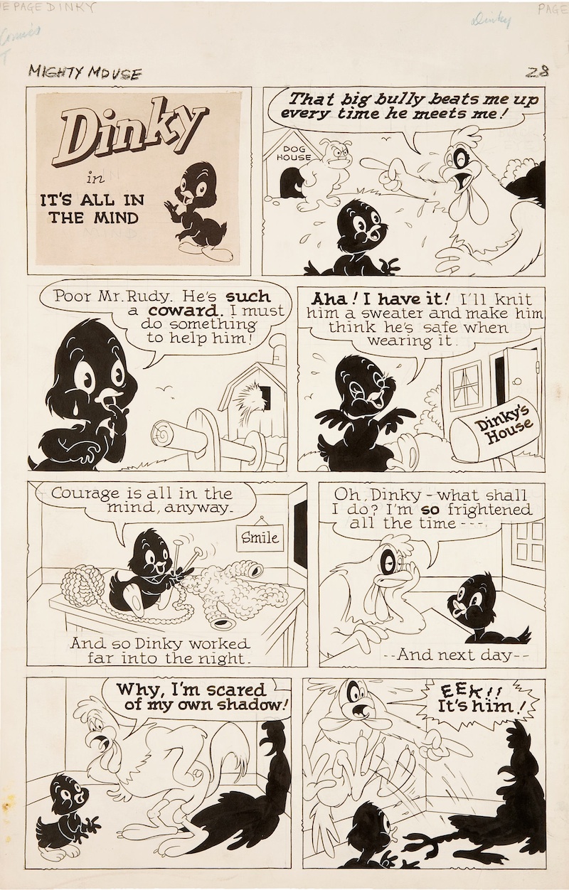
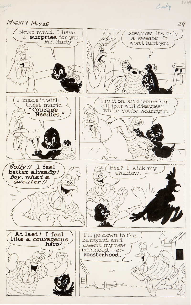
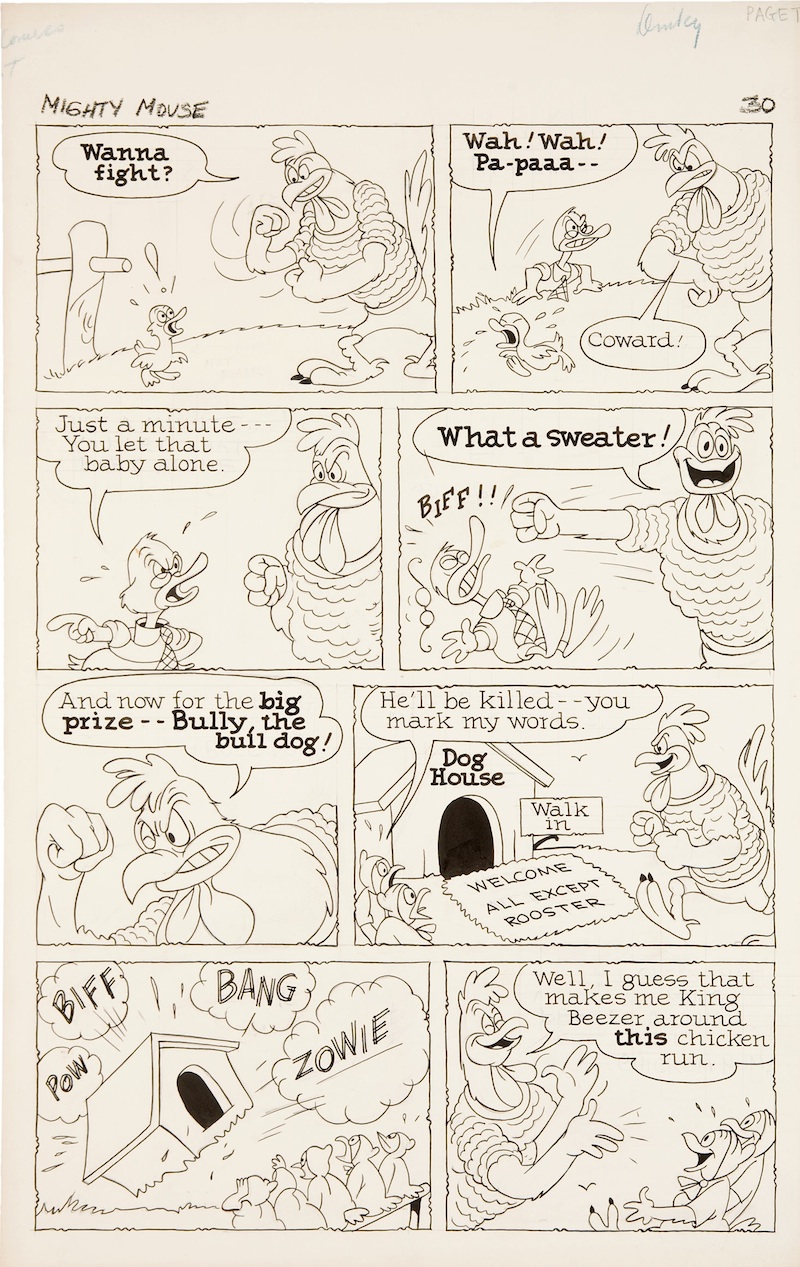
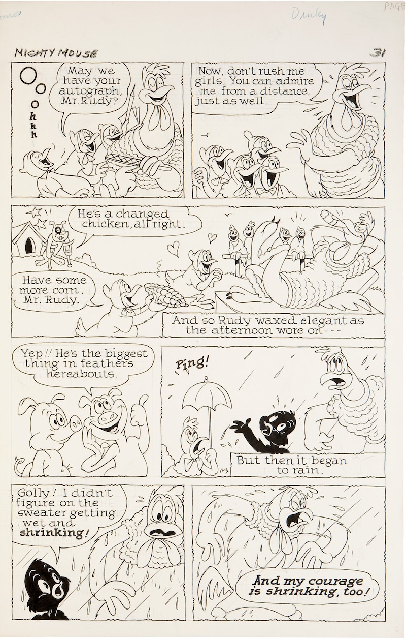
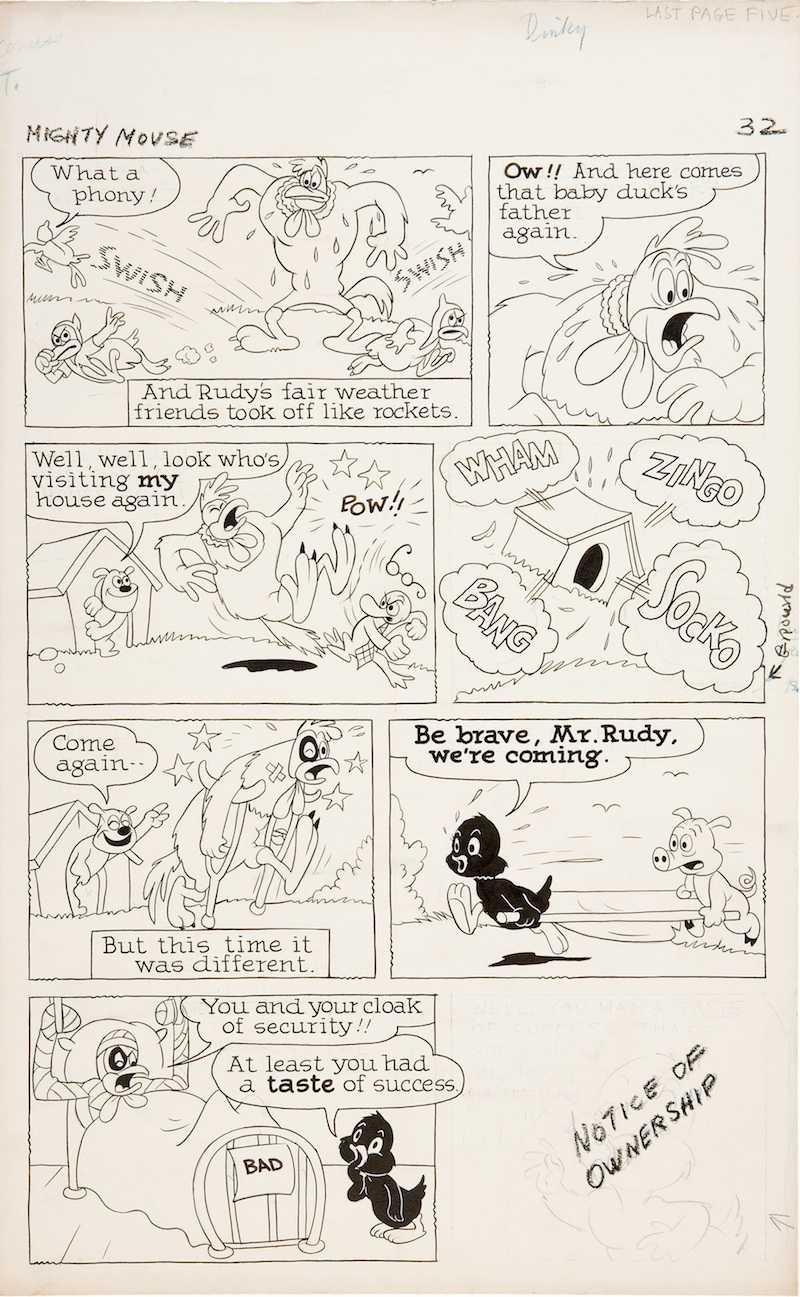
Fortunately, not all Heritage Auctions are out of the common man’s limit. I snapped up this beautiful original art by Jim Tyer for a 5-page Dinky Duck story recently. I don’t know which issue it’s from, or the year, but Milton Knight suspects 1955. From Milt:
“The lettering indicates that this was done in 1955 or slightly after; for some reason, the Terry comics adopted an upper-and-lower case font right after the CBS buyout. The change in (lovely) lettering may have been because of the change in publishers too: from St. John to Pines. The energy and quality of the art picked up, too, in my opinion.”
Update:Bob Jaques has a definite answer: Paul Terry’s Adventures of Mighty Mouse – (no issue number) April 1956.
The art and story is a good example of summing up the Terrytoons at their best. Just about every aspect about the cartoon is borderlining retarded in execution, but it’s still eerily beautiful in its uniqueness, an aura almost always coming directly from Jim Tyer. Possibly the funniest part of this story is Rudy Rooster, after getting his sweater, immediately trying to beat up a little baby, then proceeding to “BIFF!” his old man after getting a reasonable warning. Tyer (or whoever wrote the story) needs to establish that the rooster is now a douche, and gets it done as overtly as possible, capping it with the absolutely brilliant “What a sweater!” panel.
The greatest joy in owning the art is seeing some of Tyer’s original penciling and lettering by examining the pages more closely, shattering the common perception that he was always just shitting this stuff through (though in many cases he probably was). Tyer’s greatest work was a carefully calculated brand of insanity, and I’m glad he never got the opportunity to be ‘well-directed’ elsewhere because I can’t begin to imagine a Jim Tyer who wasn’t allowed to do whatever he wanted.
Daffy Dilly is a 1948 Merrie Melodies cartoon directed by Chuck Jones and written by Mike Maltese, one of the finest of their collaborations. Dave Mackey has this listed as Production #1064. That’s a little early by my calculations, given that it was released in Cinecolor, which should give it a much later number than the contemporary Technicolor releases, but who knows for sure. Unfortunately, the print I have (a late 1940s Eastman print – a real oddity in itself) is missing the shield, and the color has menstruated considerably. The original titles are fairly boring anyway, but at least everyone can see what the credits look and sound like now.
This is easily one of the most underrated of Chuck Jones’s cartoons, certainly the most underrated of the ones he did with Daffy Duck. It’s probably best-known for being brilliantly used as the framing device for Greg Ford and Terry Lennon’s Daffy Duck’s Quackbusters, the least offensive of the Warner cartoon ‘compilation’ features. But like the other cartoons chopped-and-hacked in those things, the only way to properly see it is on its own.
Daffy is still crazy in this cartoon, just a different kind of crazy than the Clampett or Tashlin Daffy. He’s deluded himself into thinking he’s a master comedian, one who can easily make a joyless geriatric “bust a seam laughing” for prize money, even though his skills aren’t worth anything on the Mean Streets. Here greed and conceit are the dominant traits of the duck’s psychosis, portrayed in a vastly more likable manner than they would be in much later Freleng and McKimson shorts. (Call me biased, but the Jones Daffy was always hilarious, naysayers take a hike to hell.)
The opening by Lloyd Vaughan captures the character’s situation perfectly. He’s sunken to about as low as he can get, peddling novelty tricks on a street corner in NYC. The pain he feels with each failed shill hits home beautifully, right until we get his desperate pitch that involves electrocuting himself to add some overt hilarity (not to mention it makes him more sympathetic/pathetic) to the scene.
I’d also like to call attention to the unusual layout and truck-in Jones and Robert Gribbroek use in the first shot. Rather than having Daffy front and center with his table, he’s more to the lower-left of the frame. It’s a daring choice, because in emulating those busy Manhattan streets, the duck could have easily gotten lost in the clutter illustrated.
Phil Monroe doesn’t get much at all to do in this cartoon, but the butler slyly stealing the bottle of ‘wine’ is a very slick and funny bit of animation. More on him later perhaps.
Ben Washam is a master of the jolly laugh. He gets a brief one with the butler at the door, and the masterful one with Cubish at the end. The animation gives a great illusion of weight and heavy-breathing required for these larger characters to have a laughing fit. The drawing is also tremendously appealing, easily outranking all the Jones animators in this category.
Finally, the centerpiece of the cartoon: the lengthy Ken Harris scene of Daffy ‘interrogating’ the butler. What’s brilliant about the scene is that it’s so stupid. Daffy is making his accusations up as he goes along, chastising the butler for everything short of communism (believe me, it was probably in the boards given Jones’s ‘liberal’ status in Hollywood). The butler gets roped into it all, proving that the lunatic duck actually is able to sell something – bullshit.
Harris is said to be the Jones animator always given the sort of challenging scenes many animators try to avoid. He gets his fair share of that here, not only getting the heaviest acting sequence, but also having to animate the cigarette being held in Daffy’s beak, a hard enough thing to draw, let alone animate.
The picture ends with Daffy taking what he can get. At first insulted by Cubish’s laughter, he’s now resigned to this lower level of humiliation than he had on the streets – at least someone thinks he’s funny.
(Thanks to Tommy José for film-to-digital transfer assistance.)
Seeing the new promo for the next bastardization of Looney Tunes jogged my memory… Didn’t my old friend Jon Cooke (also the co-author of this blog) do a gag drawing back in 2003 ‘predicting’ what a Cartoon Network revival of the characters would look like in the ‘modern’ style (the jagged inbreeding of UPA, Lynne Naylor, and anime)? As in, something sketched and colored in Photoshop in about ten minutes?
So much for seasoned professionalism in TV animation. Here’s to another year of crap.
Fellow youthful animation historian Charles Brubaker has been busy at work interviewing the surviving personnel of the DePatie-Freleng studio. The first of the interviews he’s posted is with DePatie himself: part one here and part two here (part three forthcoming). Charles’s research will be a welcome addition given the lack of information available about the studio. Leonard Maltin unwisely chose to write off the whole studio by just stating in Of Mice and Magic that the cartoons got worse every year.
For the record, I love the first few years of DePatie-Freleng cartoons, the Pink Panther series specifically (theatrical animation’s last creative burst). They serve as a reminder that limited animation doesn’t have to be ugly, unfunny, and badly timed. A cartoon like Dial “P” for Pink is as sharp as any of the better Bugs Bunny shorts Freleng directed, only done for a lot less money. Even Bill Lava’s soundtrack is a great exercise in blending the two Mancini themes.
It’s a shame though that Charles didn’t ask DePatie why the Pink Panthers are usually very funny while the Daffy Ducks the studio did were sheer eye rape.